Design & tech · 4 min read
Why we use Fraunces and Inter — and why not every site should look like a SaaS
A short essay on type choices for local-business landings, why every startup looks the same, and the type system behind every Hellodebut debut.
designtypographyweb-designbranding
Open ten startup websites in 2026 and you will see the same thing on nine of them. Inter for everything, optionally a slightly heavier Inter for headings, a thin sans for "this is the kind of company we are" all the way down. The site looks competent. It also looks like every other site.
This is not an accident. Inter was free, Inter was excellent on every screen, Inter became the safe choice. Safe choices accumulate. A whole generation of websites converged on the same visual identity because nobody got fired for picking the same thing as everybody else.
For a local US business, the same logic produces the wrong outcome. A barbershop in coastal Maine should not look like a YC-backed B2B SaaS. Neither should a roofing company in Albuquerque. They have a different job. They are trying to convey: I am the kind of place a person you trust would recommend. That requires character.
This is the type system every Hellodebut debut ships with, and why.
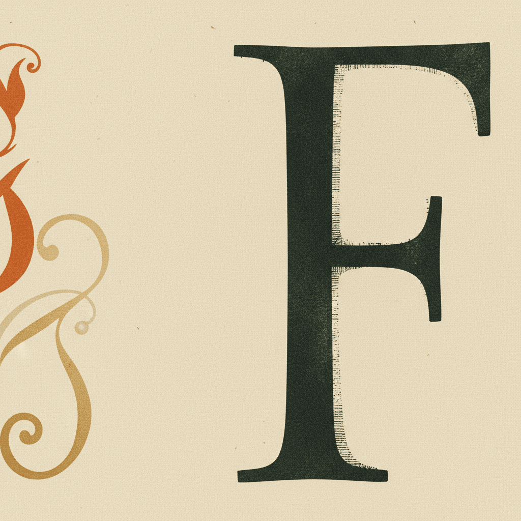
The display face: Fraunces
Fraunces is a variable serif by Phaedra Charles, Flavia Zimbardi, and David Berlow. It is contemporary but warm — it has the proportions of a classical serif and the optical character of something hand-drawn. At larger sizes it can stretch into a near-display weight; at smaller sizes it stays readable.
Why Fraunces and not Playfair or Caveat or one of the trendy options?
- Versatile: it carries an editorial H1 and a hand-set H3 without feeling like two different families.
- Open source: free to embed, no licensing complications.
- Optical sizes built in: the same font file behaves differently at 12px and 64px, the way a hot-metal typographer would have specified separately. Modern web typography rarely uses this; Fraunces makes it free.
- It does not look like every other site. That last reason matters.
The body face: Inter
We do use Inter — but only for body text. Inter by Rasmus Andersson is genuinely the right tool for paragraphs on screens. It was designed for UI legibility, the proportions are excellent at every weight, and it does not fight the display face. A serif display face needs a clean, neutral body face to set off — Inter is exactly that.
The mistake is using Inter for the headings too. The H1 of a small barbershop should not look like the H1 of a Stripe landing page. Fraunces solves this.
The palette: warm earth, single accent
The palette in every Hellodebut debut is in the same family, varied per business:
- A warm cream as the base (
#FAF7F2, give or take) - A near-black ink for body text — deeper than
#000, with a slight warm tint - One single accent color, chosen per business (burnt orange for the barbershop, deep ocean blue for a coastal business, etc.)
- A soft secondary (muted gold, dusty green) for hover and CTAs
Three colors, possibly four. Not eight. Not a "color system with semantic tokens." Three colors carefully chosen will outperform eight colors carefully named every single time.
The actual code: CSS variables and a Tailwind config
For the design-tech reader, this is what the actual implementation looks like in a Hellodebut bundle:
:root {
  --hd-cream: #FAF7F2;
  --hd-paper: #F4EFE5;
  --hd-ink: #1A2618;
  --hd-ink-soft: #5C5648;
  --hd-warning: #C2410C; /* the accent — varies per business */
  --hd-gold: #B07D2B;
  --hd-line: rgba(26, 38, 24, 0.10);
  --hd-shadow: 0 6px 16px rgba(0, 0, 0, 0.06);
}
Plus a Tailwind theme that maps these to bg-hd-cream, text-hd-ink, etc. The whole palette is six variables. Every component composes from those.
For typography:
:root {
  --font-display: "Fraunces", "EB Garamond", serif;
  --font-body: "Inter", "Helvetica Neue", sans-serif;
  --font-mono: "JetBrains Mono", "Menlo", monospace;
}
Three families. The mono is used sparingly — for small uppercase labels, eyebrows above section headings, and one or two place-of-honor moments.
Why this matters beyond aesthetics
Type is not decoration. Type is the voice of the page. A barbershop website set in Fraunces speaks differently than one set in Inter — slower, more careful, more like a person and less like a brand. Customers feel this even if they cannot name it. The same is true of palette: warm earth tones cue a different kind of trust than the bright "tech" colors of a SaaS landing.
This is why we build each debut from scratch rather than using a template. The shop's voice should come through the page. The template fights this — Hellodebut tries to amplify it.
What you can take from this
If you are setting up your own website:
- Pair a distinctive display face with a clean body face. Do not use the same font for both.
- Pick three colors. Spend an hour picking them. Then use them religiously.
- Avoid the SaaS-default look unless you are actually a SaaS.
- Test on a six-year-old phone. If it loads slowly, simplify.
If you would rather have us do this for you, that is what Hellodebut is. The agent swarm picks all of the above for your specific business and ships you a finished landing — before you asked. Get a free preview →.